
Bean Blends Coffee Festival
My final year project at the University of Kent was an opportunity for me to showcase my UI/UX design and front-end development skills. I also wanted to highlight my brand development experience from Planet Ark.
This project’s aims were to create a front-end focused website and motion graphic that centred around a coffee festival that encompasses creative design with technical application. The coffee festival has a focus on sustainability within the industry. The website has a focus on interactivity and animation, while the motion graphic is used as promotional material. One aim was to be able to create a brand that fulfills this idea, taking into consideration the identity and messaging which dictates the design and development choices made throughout the project.
Research
The Bean Blends coffee festival project incorporates many different ideas and principles and therefore needed appropriate research in multiple areas to ensure the aims and goals of the project were achieved. The main areas of research I identified were market research to understand the current trends and success areas of other festivals and wider coffee shops, as well as research into sustainability within the industry. This would help create a brand identity that would inform all the design choices throughout the project.
Looking at other coffee festivals such as the London Coffee Festival and New York Coffee Festival, helped provide an understanding of the type of information expected on the website. I researched other festivals to gain and understanding of how their websites appeal to users, taking note of the branding as well as the presentation and hierarchy of information provided on the site. Reviewing branding of three major coffee shop chains helped realise the importance of creating a consistent brand identity for the festival and to ensure it remains accessible, visually appealing, and in keeping with the key messages.


After identifying sustainability as a focal point for the project research was focused on three main areas to cover on the site, the main issues facing the coffee industry, highlighting current schemes and initiatives that are helping to address these issues, and finally, small actions that users can implement themselves.
At this stage during the project, nearing the beginning of the production process, the next steps were to create and solidify the brand identity. My target audience were people aged 18-35, that are interested in coffee. It’s important the project’s design choices felt approachable, fun, and accessible while being distinct.
For the typefaces, being web safe was essential. The reason for this was to ensure the information on the website is accessible and inclusive, ensuring the branding has a wide appeal.

Brand Identity
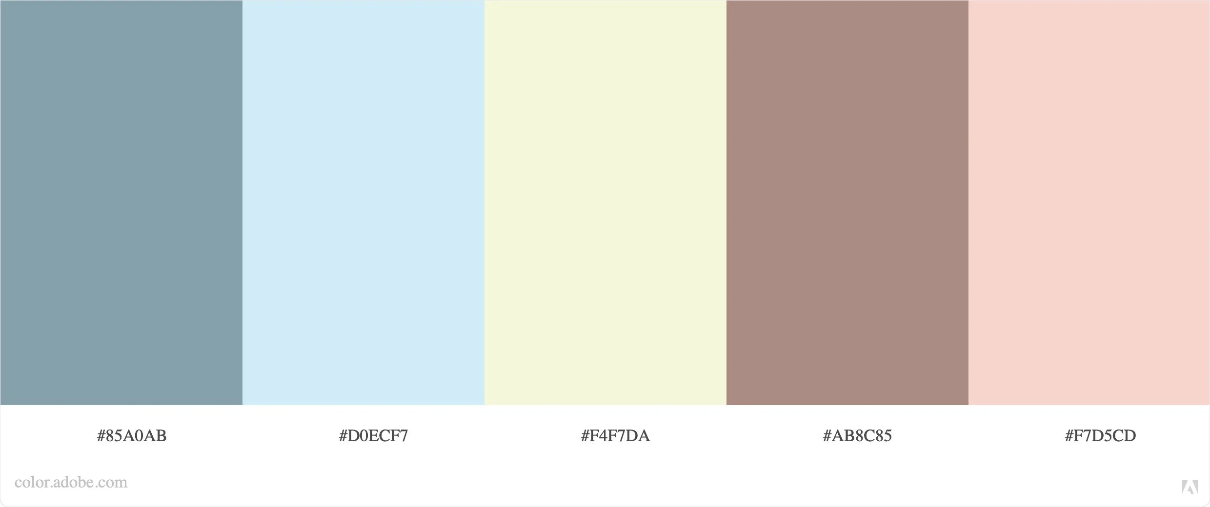
The beginning of the production process started with establishing the project’s brand identity, including colour scheme, fonts, and logo. The work started by writing down words that represent the festival and making sure any design decisions resonated with these words. Community, collaboration, caring and friendly were the four main words chosen to represent Bean Blends.
Motion Graphic Development
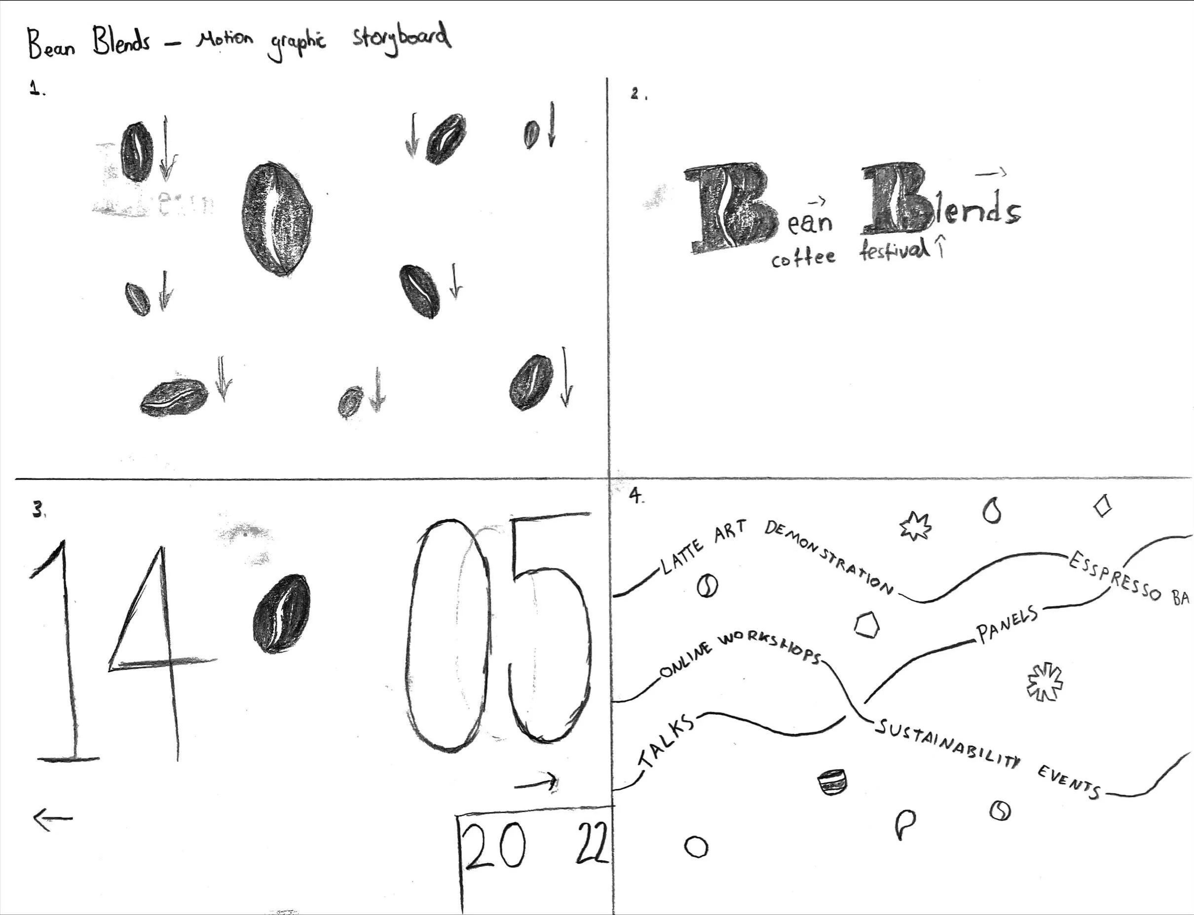
The main purpose of the motion graphic is to present the key information of the festival in a minimal and succinct way. This would be the dates, the events being held, a mention of the sustainable aspect and a call to action. I created initial sketches of splash pages before solidifying my ideas with a storyboard and an animatic created using Adobe After Effects.


Website Design and Wireframes
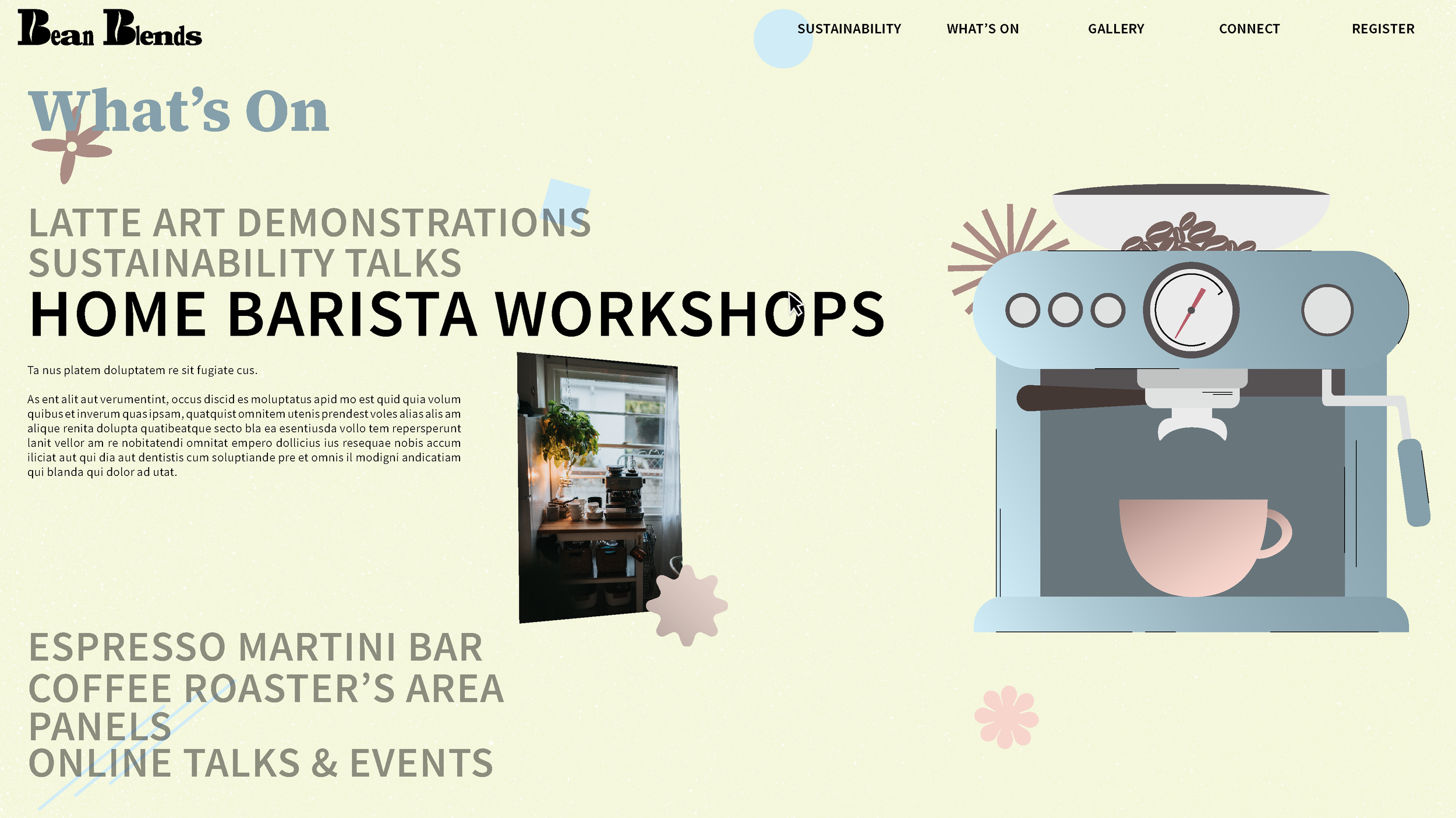
After the content for each page was established, a website flowchart was created to depict how users would navigate through the site along with what type of content would be on each page. I then developed wireframes in Figma to inform the layout and each page, denoting where the content and the interactive elements of the site would be presented.


The mock-ups were created for both desktop and mobile. The mock-ups were used to visualise the ideas for the website and bring cohesion to the design by fully using the brand identity. They follow a grid system to emulate within my site.

Website and Motion Graphic Development
The website itself is a major aspect of the project, everything is created and housed on the website and so outlining the methods and the initial structure was important before moving onto the next stages. The project was going to primarily use HTML5 as well as SCSS stylesheets. The largest learning aspect to my project was expanding my knowledge of JavaScript, learning it more in-depth as well as utilising libraries such as jQuery and using asset libraries and plug-ins. To help the learning process in reference to the interactive elements of the site, creation of multiple experimental sites that focused on the interactive elements was used, whereby experimentation and troubleshooting of the code could take place before importing them into the main website folder.
The development of the motion graphic took place after the creation of all the 2D assets in Adobe Illustrator. I then developed a rough cut featuring all the essential animations and iterated to improve the overall quality before user testing and final render process.
User Testing
Before creating the user testing survey, seven main areas to help create effective user testing were assessed. The first area was the scope, this is the web application and motion graphic. The next is the purpose, which is to gauge the function, usability, engagement, and emotional response participants have. The participants covered a wide variety of age ranges with a particular focus on the target audience of 18-35 but including some higher age ranges to seek a wider understanding of how different age groups may engage with the project. The scenario used was the user’s natural navigation through the site, noting their level of engagement with interactive elements and viewing of the motion graphic.
The quantitative metrics for assessing the user testing will be any errors occurring on the site, the time spent on the site, the time taken on each page and interactive element and their emotional response to the site. The subjective metrics were decided by a Google form which was self-reported, and the questions related to satisfaction, ease of use, how informative the site is and their overall level of interest in the event.
Learnings and iterations
Overall, it seemed the design of the site was well received by users and the branding appeared to be successful in being distinct yet accessible. The motion graphic was overall received well also. However, from user testing it was found that accessibility in specific regard to the interactive elements could be improved, it was observed that some users found it easy and intuitive to interact with some elements such as the coffee machine, yet others struggled more. Some of the interactive elements could’ve been better integrated with the information on the site. Whilst this means the relevant information is accessible and easy to find for all users, it also results in the interactive elements lacking stronger purpose on the site, reducing their role to more visual and creative than a core element of the user experience.
To improve accessibility, further text prompts were added for users on the Home and What’s On pages to help them more easily engage with the site. A location for the festival on the home page was also added as some users found this to be an important element missing.
Reflection
Overall, the main aims and goals of the project were achieved. The project managed to create an interesting and diverse user experience while remaining informative and maintaining a clear focus. The design across the website and motion graphic is cohesive and establishes a clear brand identity that is maintained. The motion graphic is clear on delivering its aims of being an introductory and exciting video to introduce the festival.
An area of the project I would like to develop if I had more time would be the level of accessibility. During my initial idea I wanted the mobile site to have a more important role due to how people engage in the online space today. Integrating the interactive elements further into the site would be another aspect of the project I would develop. Adding more information available through them would be a good way to increase their functionality.
I achieved a first class honours for this project and my degree.